

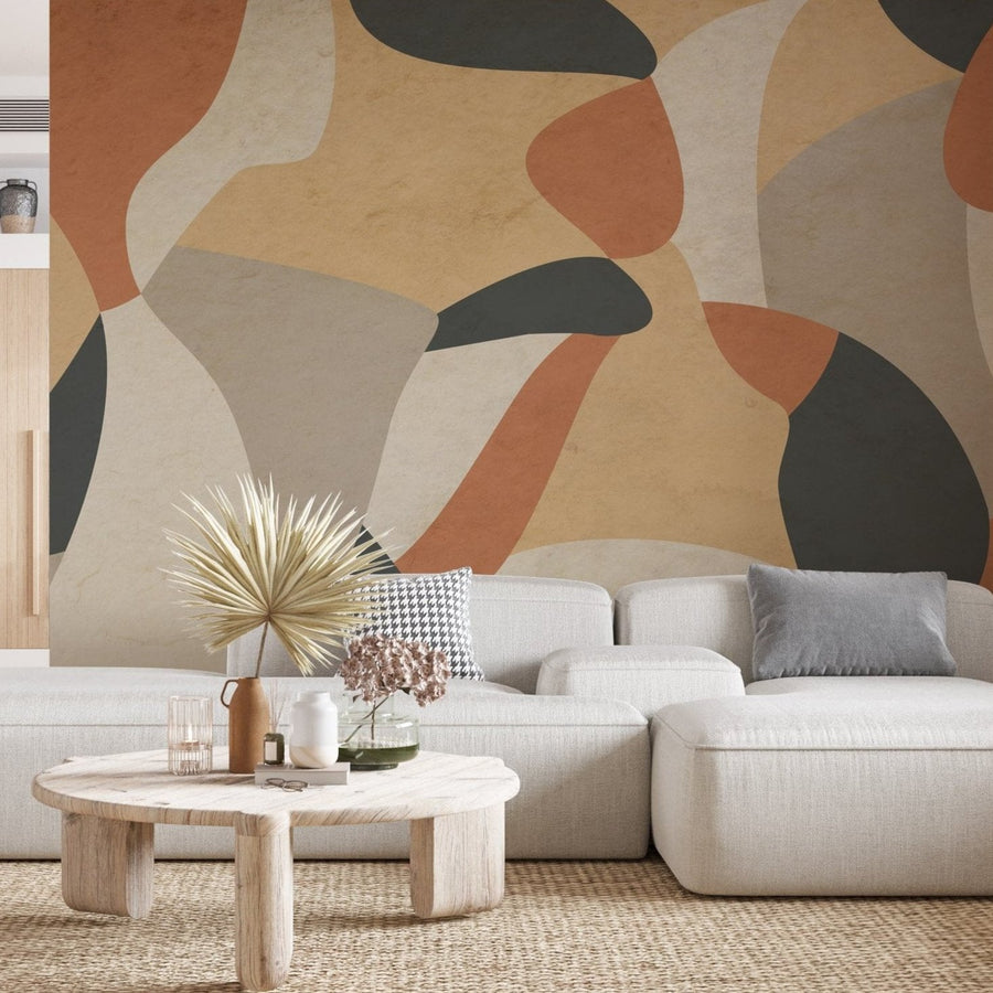


Abstract Mural Styles
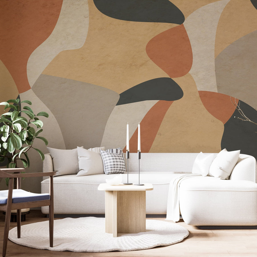
Abstract murals split into a few distinct looks, and the texture matters as much as the color.
Painterly and brushstroke. Loose watercolor washes and visible brush marks give the wall a painterly quality at large scale. They sit well in a room with simple furniture, where the wall is meant to be the focal point.
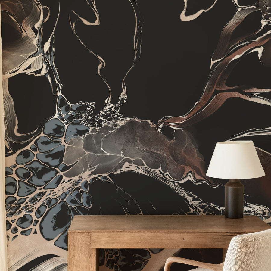
Fluid art and alcohol ink. Poured, marbled, and ink-bloom designs have more movement and contrast. Designs such as Bespoke Black Marble or Blue & Gold Abstract Marble use stronger contrast and movement, making the wall itself the main visual element.
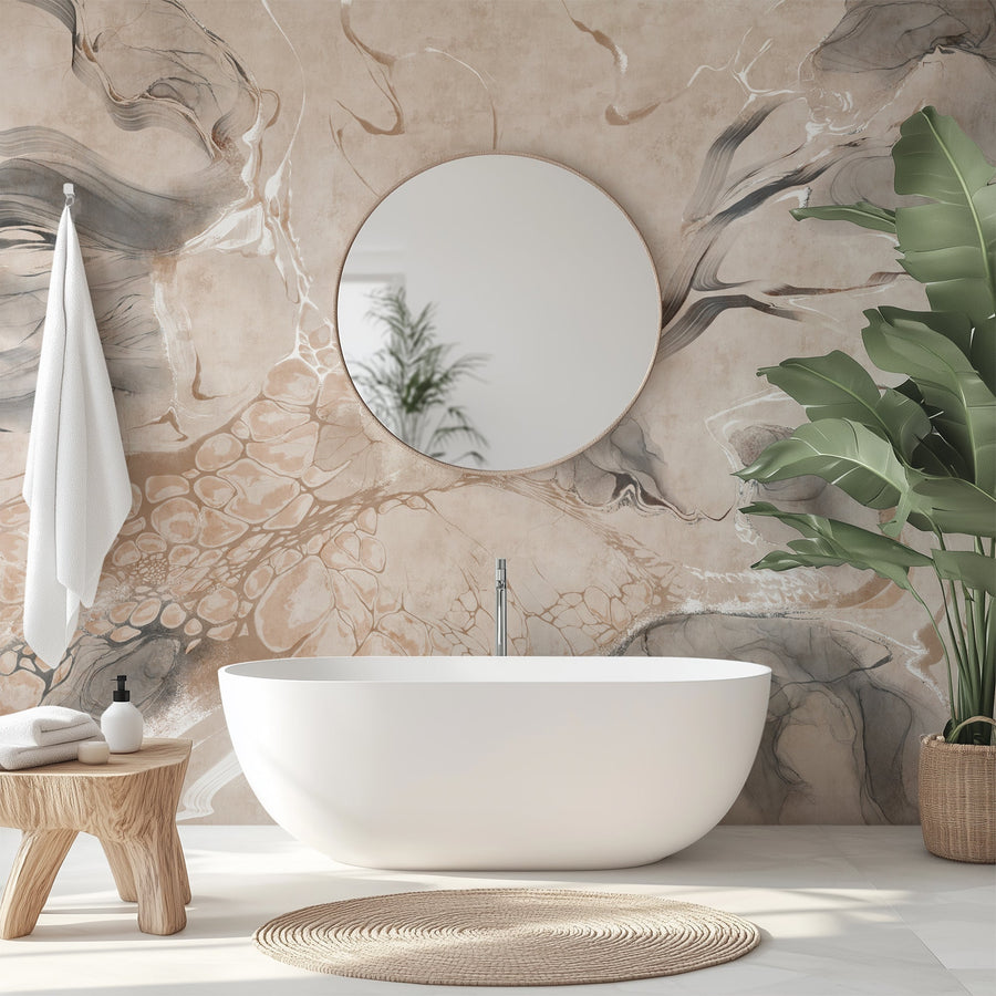
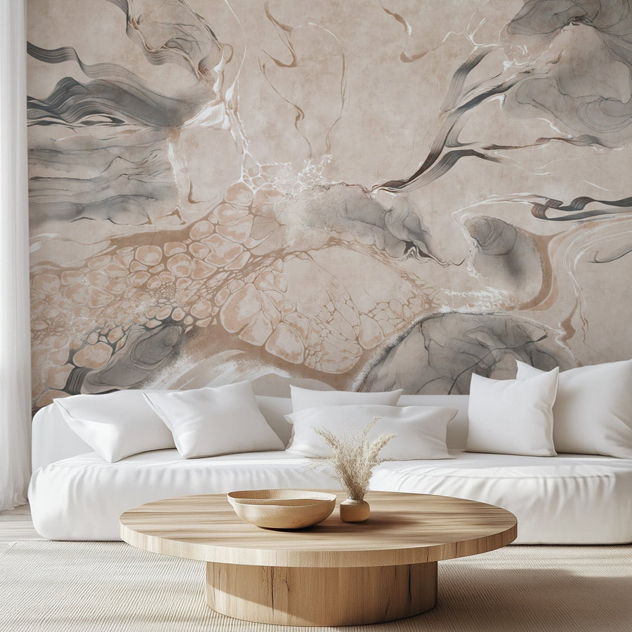
Faux marble and stone. Calacatta-style marble and subtle stone textures reproduce the visual movement of natural surfaces without using actual stone. Some are quiet and tonal; others use stronger veining and contrast as the focal point.
Plaster and limewash. Venetian plaster and limewash reproduce a hand-troweled wall finish as a printed mural — warmth and tonal depth with no literal pattern. For a woven rather than troweled texture, the faux grasscloth range is the closest alternative.
Where an Abstract Mural Works
Abstract murals are often less dependent on exact subject placement than scenic murals, because there is no horizon, character, or landscape element that must sit in a specific position. On a living room feature wall behind a sofa, a large wash or marble composition works like oversized art. In a bedroom, a softer plaster or watercolor behind the bed adds depth without a busy repeat.
The same quality suits an office, entryway, or a commercial lobby, where a design needs presence without reading as themed. For hospitality and other high-traffic installs, the material matters as much as the look — see the materials section below.
Manufacturer tip: Abstract murals can tolerate furniture, outlets, and other wall interruptions better than murals built around a specific character or landscape. Before ordering, still check the full composition — strong brushwork, veining, or a concentrated area of color can become a focal point even when the artwork is abstract.
Scale, Color, and Light
Abstract murals are generally less dependent on exact subject placement than scenic murals, but scale and cropping still affect how the composition reads on the wall. There may be no character or horizon to preserve, but concentrated areas of color, veining, or brushwork can still change noticeably when the composition is cropped. A large, open wash can work in a small room when enough wall stays visible for the movement to read.
Color and contrast do the heavy lifting. A pale plaster or neutral marble creates a quieter background, while dark fluid-art and high-contrast designs carry more visual weight and make the wall more prominent. Order a sample and check the dominant colors in daylight and in evening light, and against the room's furniture and finishes, before you commit.
Peel & Stick vs Traditional Type II
Every mural in this collection is available in all of our material options.
Peel and stick is self-adhesive and installs on a smooth, clean, properly painted, fully cured wall. We make it in Smooth Vinyl, with a semi-gloss finish, and Canvas, with a matte woven texture; both are removable. EazzyWalls currently recommends allowing newly painted walls at least eight weeks to cure before installation.
Traditional Type II is paste-installed and commercial-grade, tolerates slight wall texture that peel and stick does not, and is Class A / Class 1 fire rated (ASTM E84). For an office, hotel, restaurant, or other commercial space, Traditional Type II may be appropriate where a commercial-grade wallcovering is required; confirm the project's own fire and building requirements before specifying a material. The commercial Type II wallpaper collection covers those uses.