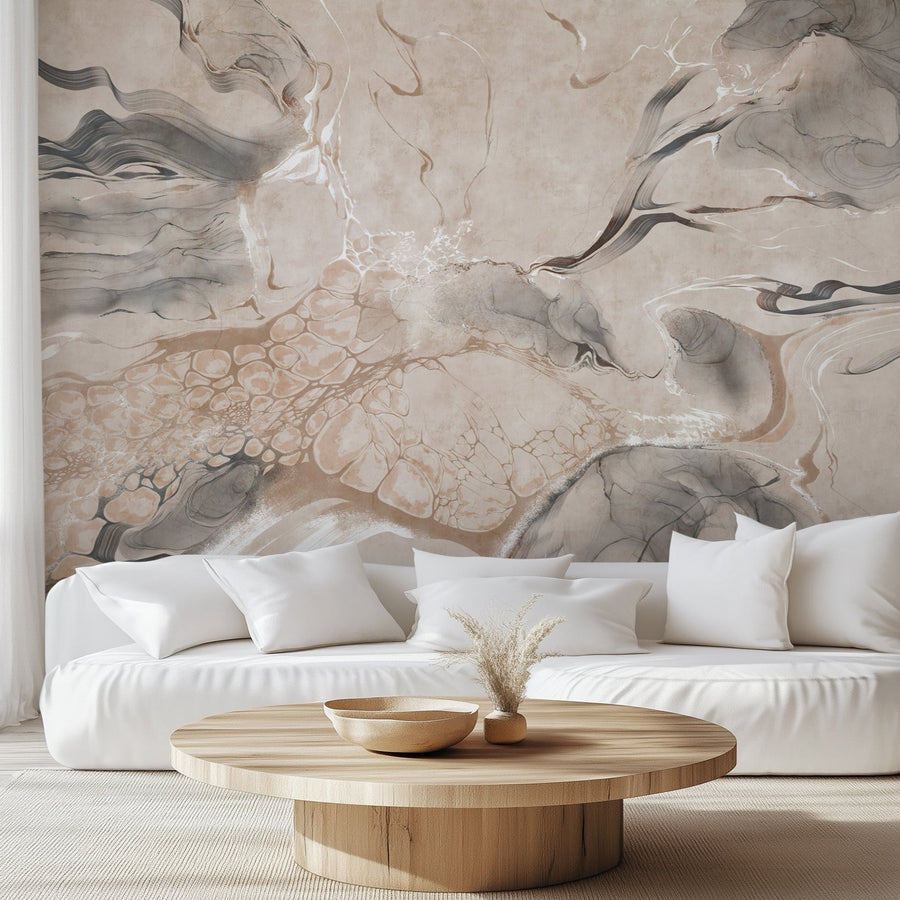
A classy living room wallpaper does one of two things: it either disappears into the background as quiet texture, or it becomes the one thing everyone notices when they walk in. The ten looks below lean toward the second — styles with pedigree and staying power, the kind of wallpaper that reads as considered rather than trendy and still looks right years from now.
The wallpaper styles considered classy for a living room are chinoiserie murals, toile, damask, William Morris-style botanicals, art deco, mid-century geometrics, bold florals, forest and tropical murals, and modern textured neutrals. The right choice comes down to your room's light, scale, and architecture, the size of your walls, and how much the pattern should compete with your furniture.
We produce every wallcovering roll to order in our Florida facility, which gives us a close view of the styles, scales, and colors people actually choose for living rooms — not just the ones that photograph well. What follows is a working editor's guide, organized by style, with a note on where each one earns its place. Start with the complete living room wallpaper collection, then dive into whichever direction pulls you in.
Editor's Note
"Classy" in a living room comes down to restraint, scale, and placement. A large mural or an oversized pattern often works best on a single feature wall, where it reads as intentional. But quieter classics — toile, damask, William Morris-style botanicals, subtle geometrics, and tonal designs — can wrap an entire room beautifully without overwhelming it. The art is matching the pattern to the wall it lives on.
In this guide
- The 10 Styles at a Glance
- 1. Bold Floral
- 2. Forest
- 3. Tropical
- 4. Modern Textured
- 5. Chinoiserie
- 6. William Morris-Style
- 7. Damask
- 8. Art Deco
- 9. Mid-Century
- 10. Toile
- What Makes Wallpaper Look Classy?
- Classy Living Room Wallpaper Colors
- Mural vs. Repeating Pattern
- How to Choose (and Avoid Mistakes)
- FAQ
The 10 Classy Styles at a Glance
| Style | Best For | Typical Palette | Best Placement |
|---|---|---|---|
| Bold Floral | A dramatic focal point | Dark grounds, jewel tones | Feature wall |
| Forest Mural | Depth and calm in open-plan rooms | Grisaille, greens, soft gray | Largest wall |
| Tropical | Bright, relaxed, coastal rooms | Pastel blue, cream, green | Feature wall or full room |
| Modern Textured | Architectural, understated rooms | Warm neutrals, tonal | Full room or feature wall |
| Chinoiserie | Quiet grandeur, art-like walls | Soft blue, ivory, blush | Feature wall |
| William Morris-Style | Classic English character | Gray, green, blush, cream | Full room or feature wall |
| Damask | Formal, grand rooms | Red, green, black, tonal | Full room or feature wall |
| Art Deco | Glamorous, dramatic rooms | Green & gold, black | Feature wall |
| Mid-Century | Relaxed, design-forward rooms | Warm retro tones | Full room or feature wall |
| Toile | Collected, European character | Blue, red, black on cream | Full room or feature wall |
1. Bold Floral Living Room Wallpaper
Nothing anchors a living room quite like a large-scale floral. A dark, moody floral bloom wallpaper turns the wall behind the sofa into the room's focal point — dramatic, enveloping, and surprisingly easy to live with because the deep ground reads almost as a neutral once your eye settles. According to EazzyWalls sales analytics, Bold floral wallpaper is the most requested classy look we produce, and it pairs beautifully with simple upholstery and a little brass. Pull one color from the print into a cushion or a lampshade and the whole room clicks together.

2. Forest Living Room Wallpaper
A forest scene brings depth and calm that a flat pattern can't. Misty trees, soft grisaille tones, a sense of looking through the wall into a landscape — it's a restful way to make a big statement. A scenic forest wall mural works especially well on the largest wall of an open-plan living room, where it reads like a window onto somewhere quieter. Keep the furniture low and simple so the scene has room to recede.

3. Tropical Living Room Wallpaper
Tropical wallpaper and wall mural isn't only for sunrooms. In a soft, pastel palette — think powder-blue palms rather than hot jungle brights — it reads as fresh and airy, a classy way to bring movement and a little escapism into a living room. A palm or botanical mural suits a bright room with plenty of light, and it looks wonderful against rattan, linen, and pale wood. It's a particularly good fit for coastal and relaxed, resort-style interiors.

4. Modern Textured Living Room Wallpaper
Modern doesn't have to mean cold. Contemporary living rooms often lean on texture and tone rather than busy pattern — a softly textured feature wall, a quiet tonal finish, an airy neutral that adds depth without shouting. Choose this direction when you want the wallpaper to feel architectural: a backdrop that makes clean-lined furniture and good lighting look intentional. It's understated, forgiving, and one of the few looks that works just as well across a whole room as on a single wall.

5. Classic Living Room Wallpaper: Chinoiserie Elegance
Few styles turn a single living room wall into a work of art the way chinoiserie does. Hand-painted-style scenes of cranes, blossoms, and branches read as collected and timeless, and a pale ground — soft blue, ivory, blush — keeps all that detail calm enough to live with every day. A chinoiserie mural behind the sofa gives a room instant pedigree. It's the classic choice for anyone who wants quiet grandeur rather than loud pattern.

6. William Morris-Style Living Room Wallpaper
William Morris-style wallpaper patterns bring classic English character through dense, nature-led motifs that feel intricate up close but surprisingly calm from across the room. Acanthus, with its big scrolling leaves, turns architectural and surprisingly modern in a soft gray, giving a living room real gravity without relying on color. Their Arts and Crafts influence gives a living room a layered, collected quality without relying on passing trends.

7. Damask Living Room Wallpaper
For sheer formality, little rivals damask — ornate, symmetrical scrollwork that has signaled luxury for centuries. In a living room it brings heritage drama, especially in a rich colorway like classic red, deep green, or black against a tone-on-tone ground. Keep the rest of the room restrained and let the pattern be the statement; solid upholstery and a little gold or brass echo the pattern's formal sheen. It's the choice for a living room you want to feel grand.

8. Art Deco Living Room Wallpaper
Glamour and geometry define Art Deco — fan motifs, sweeping curves, and gold against deep green or black that feel luxurious and a little theatrical. It's a confident, high-end look that suits a living room with some drama to it: velvet, dark wood, and polished metal. A Deco feature wall behind a bar cart or a statement sofa gives a room a jewel-box, old-Hollywood quality. Pattern and palette do the work, so keep accessories simple.

9. Mid-Century Living Room Wallpaper
Mid-century modern pattern is all clean geometry and warm, retro color — a graphic, rhythmic look that suits a living room with teak furniture, low profiles, and a relaxed, collected feel. It's among the most understated of the statement styles: enough pattern to give a wall personality, restrained enough to sit comfortably behind everyday furniture. A great choice if you love a design-forward, lived-in room rather than a formal one.

10. Toile Living Room Wallpaper
Toile de Jouy is quietly sophisticated — single-color pastoral and scenic prints on a light ground, with a storybook charm that never tips into fussy. A vintage equestrian toile in black and white is especially striking in a living room, bringing a collected, European sensibility that suits both a formal sitting room and a relaxed country-style space. Pair it with painted furniture and simple linens, and it reads effortlessly elegant.

What Makes Wallpaper Look Classy in a Living Room?
Classy wallpaper is less about the pattern itself than about how it sits in the room. Scale and proportion come first: a large motif needs a generous, uninterrupted wall to complete its repeat, while a tighter design suits a wall broken up by windows and doors. Color restraint matters too — a considered, limited palette almost always reads as more expensive than a busy, high-contrast one. Then there's balance: let the wallpaper lead and keep upholstery and larger furniture quiet, so the two aren't competing. Pattern density, placement, and the room's own architecture — ceiling height, trim, the size of the wall behind the sofa — all shape whether a design feels tailored or chaotic. Get those right and almost any pattern can look elegant.
What Colors of Wallpaper Look Classy in a Living Room?
Color does much of the heavy lifting. A few palettes read as sophisticated almost regardless of pattern:
- Warm neutrals (greige, taupe, sand) — the easiest, most flexible choice, and a natural fit for modern and transitional rooms.
- Soft blues — calm and timeless; especially good with chinoiserie and toile in lighter, airy rooms.
- Deep greens — rich and grounding, a strong backdrop for William Morris-style, damask, and art deco.
- Muted burgundy and red — warm and traditional; damask and toile wear these beautifully in formal rooms.
- Ivory and cream — quiet and elegant, and the safest way to bring in a large pattern without weight.
- Charcoal and black — dramatic and modern; best as a feature wall in a bright room, where they add depth rather than close the space in.
Wallpaper Mural vs. Repeating Pattern Wallpaper: Which Works Better in a Living Room?
Both work — the right call depends on the wall and the effect you want. A wall mural is a single, scene-like image, so it shines on one large, uninterrupted feature wall where it can read as art: forest scenes, chinoiserie, and tropical landscapes all fall here. Because a mural is sized to a specific wall, it's less suited to a room chopped up by windows and doors. A repeating pattern — damask, toile, William Morris-style, geometrics — tiles seamlessly, which makes it the more flexible option for wrapping a whole room or covering awkward walls. As a rule: choose a mural for maximum impact on one wall, and a repeating pattern when you want cohesive pattern across the whole space or need to work around architecture.
How to Choose (and Avoid Mistakes)
A few things we tell shoppers again and again:
- Decide feature wall or full room. A big mural or oversized pattern usually has the most impact on one wall — the sofa or fireplace wall is the natural choice. But toile, damask, William Morris-style, and tonal designs can wrap a whole room without overwhelming it. Match the approach to the pattern rather than defaulting to one.
- Scale to the room — and the wall. Scale is more than big-versus-small. A large, high-contrast pattern needs a generous, uninterrupted wall to look deliberate; a dense or busy design can overwhelm a room already full of patterned furniture, while a low-contrast or tonal pattern stays calm even at a large scale. Weigh pattern density, contrast, your furniture size, and how much unbroken wall you actually have — not just the size of the motif.
- Test color in your own light. A design can read warmer or cooler depending on your windows and bulbs. It’s an easy mistake to avoid — order a sample and view it in the room throughout the day before you commit.
- Let the pattern lead. Keep larger furniture calm and let the wallpaper be the statement. A busy wall and busy upholstery compete; a bold wall with quiet furniture looks intentional.
- Pick your material for the job. Our peel and stick wallpaper is removable and renter-friendly; Traditional Type II is a permanent, paste-installed option. Every design is made to order in both, with GREENGUARD Gold certified inks.