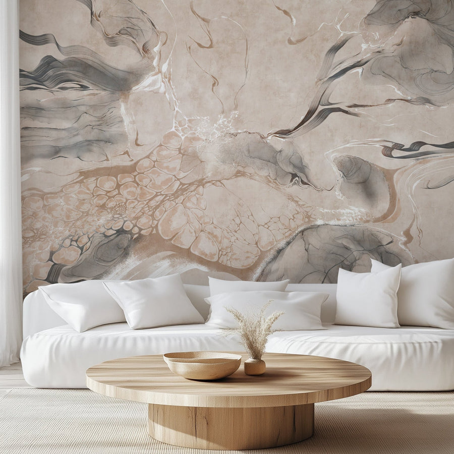
Dining rooms are especially well suited to wallpaper because the space is visually contained and the table gives the room a natural focal point, where people sit and look, and it's seen in two very different lights: flat daylight during the day and warm, pooled lamplight at night. That combination of a defined sightline and shifting light is exactly why pattern, contrast, and scale read so strongly here, and why a design that feels overwhelming in a hallway can feel composed and intentional over a dining table.
Below is a practical look at the dining room wallpaper ideas worth considering right now, how to judge color and scale for the way the room is actually used, and the installation details that separate a result you love from one you second-guess.
Editor's note: We produce all of our wallpaper and wall mural products to order in our Florida facility, so the advice here comes from what actually ships and installs well in dining rooms, not from a trend roundup. Where a point is about how a pattern behaves on a real wall, it's grounded in that experience.
In this guide
- Dining room wallpaper trends worth watching
- Styles at a glance
- Ideas by style
- Accent wall or full-room wallpaper?
- How pattern scale changes the room
- Best dining room wallpaper colors
- What works behind a table or sideboard
- When a mural works better than a repeat
- Dining room wallpaper and lighting
- Common mistakes
- How to choose
Dining Room Wallpaper Trends Worth Watching
A few directions keep showing up across current design coverage, and they suit dining rooms for reasons beyond fashion. Each one gives the room a clear point of view without needing a large footprint to work.
- Moody florals and dark botanicals. Deep backgrounds with cream or jewel-toned blooms read as rich under evening light and hold their own against dark wood furniture.
- Oversized botanicals and leaf motifs. Large-leaf and tree patterns give a contained room scale and movement, especially on a single focal wall.
- Damask, revisited. Modern damask keeps the symmetry and formality people associate with dining rooms but in updated colorways and larger repeats.
- Scenic and mural-style landscapes. A continuous scene behind the table turns the far wall into a view, which works when there's enough uninterrupted space for the composition to read.
- Texture and tonal pattern. Faux grasscloth, limewash, and linen looks add depth without a busy repeat, a good choice when you want warmth rather than a statement.
- Warmer, earthier color. Olive, terracotta, chocolate, and muted clay are showing up in place of cooler grays, and they flatter the warm light most dining rooms use at night.
- The papered ceiling. Treating the ceiling as a fifth wall is increasingly common over a dining table, where everyone's seated and looking up anyway. See our ceiling wallpaper ideas if you're considering it.
Dining Room Wallpaper Styles at a Glance
| Style | Mood | Typical palette | Best placement |
|---|---|---|---|
| Moody floral | Rich, intimate | Charcoal, ink, cream, burgundy | Focal wall or full room with height |
| Oversized botanical | Fresh, expansive | Green, neutral, sage | Focal wall behind the table |
| Damask | Formal, classic | Tonal, gold, deep green | Full room or feature wall |
| Scenic mural | Immersive | Varies by scene | One uninterrupted wall |
| Textured / tonal | Warm, quiet | Clay, oat, olive, taupe | Full room |
| Geometric | Modern, structured | Two-tone, metallic | Focal wall |
| Art Deco | Glamorous, graphic | Green-gold, black, jewel | Focal wall |
Dining Room Wallpaper Ideas by Style
Some wallpaper patterns change the mood of a dining room more than others. Here are a few directions worth considering, with examples from our own collection.
Moody floral wallpaper
Dark moody floral wallpaper designs work especially well in dining rooms because their contrast remains strong under lower evening light, while lighter flowers keep the pattern visible from across the table.


Botanical and scenic wallpaper
A soft botanical or scenic mural creates a very different effect from a dark floral. Instead of emphasizing pattern and contrast, it can make the wall read more like a view.


Damask and Art Deco wallpaper
For a more formal dining room, damask and Deco-era geometrics bring structure. Damask carries the symmetry people associate with traditional dining spaces; a green-and-gold Deco pattern does the same job in a more graphic, glamorous register.


Textured and neutral wallpaper
When you want depth without a busy repeat, textured and neutral wallpaper keeps the room visually quiet while still giving the walls character. Limewash, plaster-inspired finishes, and low-contrast patterns such as Quill Whispers add subtle movement without competing with the furniture, artwork, or table setting.


Accent Wall or Full-Room Wallpaper?
Neither approach is better on its own; the right one depends on the room. A single focal wall, usually the one behind the table or sideboard, is a good fit when the other walls are broken up by windows, doorways, or openings, or when you want a strong pattern to stay a highlight rather than fill the space. It's also the lower-commitment option.
Full-room wallpaper can make more sense when no single wall is large enough to carry the design on its own. Repeating patterns such as damask, smaller geometrics, and tonal textures can continue naturally around doors and windows, while scenic murals usually need one relatively uninterrupted wall for the composition to read clearly.
How Pattern Scale Changes the Room
Scale is the detail most people misjudge, and dining rooms make it easy to get wrong because of how the room is viewed. A large repeat needs uninterrupted wall area to show its full motif; break that wall up with a tall sideboard, a mirror, and two windows, and you may only ever see fragments of the pattern. A smaller repeat tolerates interruptions better but can read as busy across a big, open wall.
The practical point is that large patterns are not automatically wrong for small rooms, and small patterns are not automatically safer. What matters is how much clear wall you have and where the furniture sits.
Manufacturer's tip: Judge a sample from where you'll actually sit at the table, not from twelve inches away. A repeat that looks dense in your hand often relaxes into something balanced at dining distance, and a motif that seems bold up close can disappear across the room. View the sample pinned to the wall, at seated eye level, before you decide.
Best Dining Room Wallpaper Colors
Dining rooms often look quite different at night than they do during the day, especially when chandeliers, pendants, or sconces provide most of the evening light. A few directions and where they fit:
- Deep green. Reads as rich and settled against wood furniture and brass; works on a focal wall or wrapped full-room.
- Muted blue. A quieter alternative to green that stays calm under both daylight and evening light.
- Burgundy and muted red. Traditional dining-room colors that come alive under a chandelier; strong enough for a feature wall.
- Chocolate and olive. Earthy, enveloping tones that suit smaller or more formal rooms.
- Terracotta and clay. Warm mid-tones that pair naturally with wood and rattan.
- Cream and warm neutral. A reliable base for a textured or tonal look, letting the table setting and art carry the color.
Whatever direction you choose, test it against your fixed finishes: the wood tone of the table, the metal of your lighting and hardware, and any upholstery. A color that fights the undertone of your furniture will be the first thing you notice.
What Works Behind a Dining Table or Sideboard?
This is where a dining room differs from any other room, and where most pattern choices succeed or fail. The wall behind the table and the wall behind the sideboard are the two you look at most, and they're both partly blocked by furniture.
A tall sideboard, a hutch, or a run of framed art will cover the lower third to half of a wall. If you've fallen for a mural or a large directional motif, map out what the furniture will hide before you order. The central element of a scenic mural, the trunk of a tree, the focal bird, the horizon line, can end up behind a cabinet, leaving you with only the edges of the composition on view. On a repeating pattern this matters far less, because the motif continues above the furniture; on a one-off mural, composition is everything.
The reliable approach: measure the height of your furniture against the wall, and choose a design whose key moments live in the visible upper band, roughly from seated eye level up. For murals specifically, confirm the panel layout against that visible zone before committing.
When a Wall Mural Works Better Than a Repeat
A wall mural is the right call when you have one wide, largely uninterrupted wall and you want it to become a view rather than a surface. Scenic landscapes, chinoiserie panels, and oversized single-scene botanicals all depend on continuous space to read as intended, so they reward a wall with no windows or doors cutting through the composition.
A repeat continues the same motif from panel to panel, while a mural forms one continuous image across the wall. Both murals and repeats are made of panels with seams; the difference is that a mural forms one continuous image across those seams, while a repeat matches the same motif from panel to panel. If your dining room has the wall for it, browse our wallpaper murals to see which scenes suit a single-wall application.
Dining Room Wallpaper and Lighting
Lighting changes dining room wallpaper more than almost any other factor, because the room is used across such different light. In flat daylight a color looks one way; under a warm chandelier at dinner it can look noticeably warmer and deeper, and cool bulbs will push the same paper the other direction. Grazing light from sconces or a low pendant can also catch the surface and emphasize texture and seams.
Because of that range, a sample judged once, in the middle of the afternoon, tells you only part of the story. Pin it to the wall and look at it in daylight and again at night under the fixtures you actually use. If your dining room relies heavily on candle or warm LED light, favor a paper that looks good warm rather than one chosen under a cool showroom light.
Common Dining Room Wallpaper Mistakes
- Choosing from a thumbnail. A small on-screen image hides the true scale and color of a repeat. Order a sample.
- Ignoring where the furniture sits. Selecting a mural before mapping the sideboard and art means the best part of the scene can end up hidden.
- Judging scale up close. A pattern seen from twelve inches behaves differently at dining distance.
- Overlooking evening light. A paper chosen only in daylight can shift under the warm light you dine by.
- Ignoring the wall surface. Peel & Stick wallpaper requires a smooth, properly prepared wall; choosing the material before checking the surface can create installation problems later.
- Skipping the sample entirely. It's the single step that prevents most of the mistakes above.
How to Choose the Right Wallpaper for Your Dining Room
A simple order of decisions keeps the process straightforward:
- Decide focal wall vs. full room. Base it on how broken-up your walls are and how strong a statement you want.
- Check the interruptions. Note windows, doors, the sideboard, and art before you fall for a pattern.
- Pick a scale that fits the visible wall. Match the repeat to how much clear wall you actually have.
- Match color to fixed finishes. Work from your table's wood tone, your metals, and your upholstery.
- Choose material by wall surface. Smooth, sound wall and want simple installation or removability, consider peel-and-stick; otherwise Traditional Type II. The design is available either way.
- Order a sample and view it in both lights. Daylight and evening, from where you'll sit.
Ready to compare designs for your room?
Once you know the direction you want, browse florals, geometrics, murals, damask, and textured designs in one place.
Shop Dining Room Wallpaper